Peloton Commercial NextGen OS
Background
At Peloton, I had the incredible opportunity to help design an entirely new operating system - NextGen OS - in collaboration with a team of visionary designers, engineers, and product thinkers.
This wasn’t just a redesign; it was a complete reinvention of how users interact with Peloton’s fitness ecosystem. We set out to build a seamless, personalized, and socially connected experience that would power the future of fitness - whether on a console or on an app.
As a core Product Designer on the NextGen team, I was deeply involved across every phase of the product lifecycle: from foundational user research and early connecting, to design iteration, prototyping, and final visual design. This work laid the foundation for a wide range of initiatives across the Peloton platform.
Peloton Mobile App
Peloton Commercial / Precor - NextGen Cardio Equipment
Below, I’ll take you through a deep dive into one of the flagship project I led - shipped and used by thousands of fitness enthusiasts around the world.
This is just one story from my time at Peloton, and I’d be thrilled to share more of the projects and design challenges I tackled during this transformative chapter.
PrecorCast (Featured Case Study)
PrecorCast, Precor’s proprietary Chromecast solution, allows exercisers to easily connect their phone to the console, enjoy their streaming app of choice, and feel secure knowing that when they end their workout, the device will remove all elements of their connection to the console.
Role: Lead Designer (UX Design, UX Researcher, Usability Testing, Prototyping, DesignOps
Tools: Figma, Adobe Suite, Principle
Team: NextGen OS Team
Company: Peloton Interactive

Business Problem + Context
The existing Precor media experience was limited by a fixed set of streaming outlets, falling short of the dynamic and flexible media consumption users have grown accustomed to through consolidated casting platforms like Roku, Google Chromecast, Amazon Fire-Stick, and Apple TV.
The current Precor console models (P62 & P82) only offered two streaming channels (Netflix & Hulu) to users including a live tv channel. This created limitations in what users can watch in comparison to the popular multimedia devices that offer a lot more freedom and flexibility.

‘Current’ Precor Media Streaming Experience on P62 & P82 Consoles

We partnered with Google Chromecast to implement their multimedia device to be embedded within our fitness consoles to build the foundation of providing a service of endless streaming freedom to our commercial fitness users.
With a multimedia device now being offered within our consoles back-end wise, we needed to bridge the gap of helping users find, pair, and stream their devices when hopping onto their fitness consoles. Therefore, an introductory onboarding pairing process needed to be designed and developed to bring this solution to life.
The goal was to make connecting personal streaming devices feel intuitive, friendly, and frictionless—even in the busy, transient environment of a fitness facility. This meant rethinking traditional pairing flows to prioritize simplicity, speed, and user confidence from the very first interaction.
To bring this vision to life, my design task centered on creating a seamless onboarding and device pairing experience for users on Precor's NextGen Consoles.

Research & Discovery
Usability Heuristic Evaluation
I needed to familiarize myself with the pairing process of other environments. I looked into what experiences existed that were familiar with the design task I was given. Given that the product I was working on was unprecedented, this research challenged myself in identifying similar UX experiences and user conventions that existed in different spaces during the pairing phase.
The aim was to understand the what, why, and the how behind these onboarding experiences. Approaching this research from the consumer perspective - as a user…
What can this screen help me understand and do?
Why this UI layout during this phase of the onboarding experience?
Why the phrasing of these instructions?
The pairing process experience in other environments are dependent on UI, space, and technicality.

Hotel Space - Otrum ‘Coachmark UI’ for Pairing Device

A mixture of coachmark, single, and two step UI is used in different environments. Depending on which type of UI is designed, it affects the narrative and storytelling of informing the user what to do next and when to do so.
Hyatt Hotel Space - ‘2 Step/Coachmark UI’ for Pairing Device
It was not only the UI and information presented that I analyzed but the length of the process as well. Pairing your device in the home space (Google Chromecast) took longer on average than pairing your device in the hotel space.

Home Space - ‘1 Step UI’ for Pairing Device
A user has more time to commit when in the comfort of their home, but in a convenient setting like a coffee shop, fitness space, or a hotel, that window may be shorter. Time matters - from our previous fitness data coming into this initial research phase, the fitness user on average takes about 30 seconds to begin their fitness experience on the console.
Getting to know our users
I gathered insight of experiences and user conventions from survey responses, user interviews, and reviews/websites/walkthroughs regarding existing products that carry this onboarding pairing experience to get a sense of what users are using. I wanted to hear first hand my target audience’s experience to cater the final product toward their needs.

Users gave up during the pairing process due to longevity and complexity.
Users didn’t know where to find media ‘entry point’ to pairing phone.
Users were afraid to share personal information (stream account, content, and personal info)
As a result of our research, I discovered significant findings.
From the findings discovered, I noticed that these pain points gravitated towards three overall themes…


I used user personas to distill insights from my initial research and competitive analysis, helping me better understand the pain points and motivations of our target audience. By mapping out their user journeys, I was able to pinpoint friction points and moments of delight throughout their interaction with the product. These personas became a valuable tool in empathizing with users, aligning the team around user needs, and guiding design decisions that directly addressed the gaps uncovered during discovery.
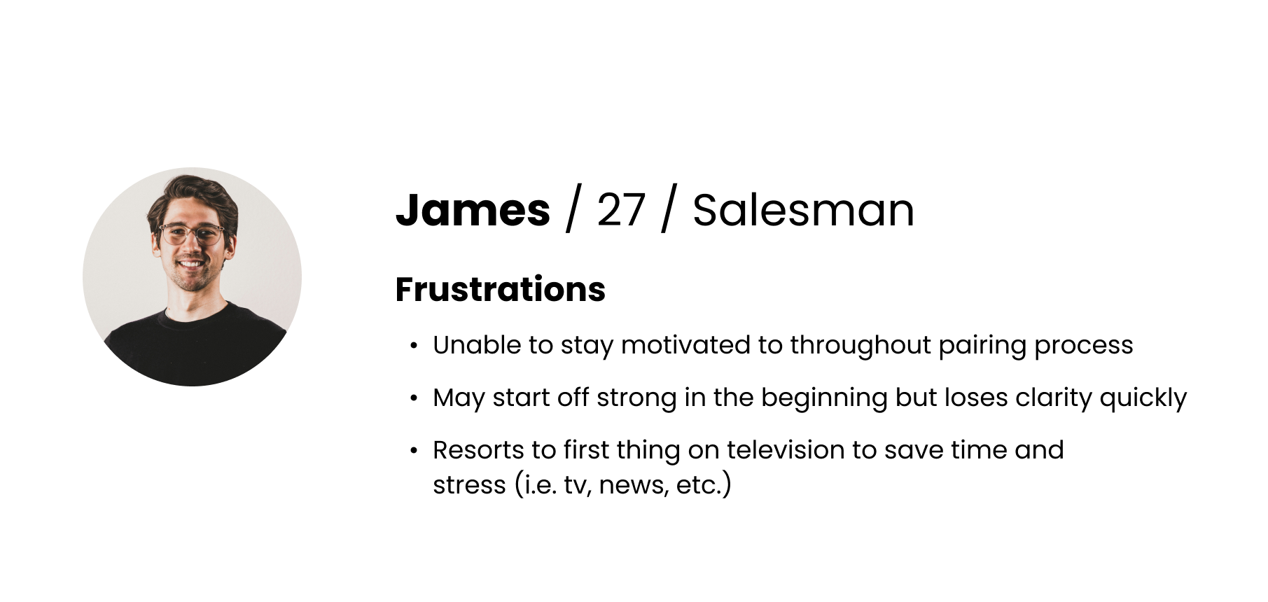

I created a user journey map to visualize the end-to-end experience of our users, drawing insights from early research and competitive analysis. Mapping out each step helped me identify key pain points, emotional highs and lows, and opportunities for improvement. It gave me and the team a clearer understanding of where users were getting stuck or dropping off, and allowed us to prioritize features and fixes that would have the most meaningful impact. The journey map became a central reference throughout the design process, keeping our focus grounded in real user experiences.


Design Concepts / Explorations
There were several different concepts to explore. Based on our research and findings, we wanted to explore different layouts when it came to the onboarding experience. It was a matter of combining different user interface interactions, designs, and storytelling in order to make the onboarding experience fairly easy, quick, and reliable.
With that being said, we divided the onboarding experience into three major events based on our external and internal research:
INTRODUCTION / LANDING PAGE
The UI Screen the users see at the beginning of their journey to pairing/connecting their preferred device.
PAIRING STEPS / EXPLICIT PAIRING INSTRUCTIONS
The instructions and support imaging that inform the user what steps they are to execute to connect their device as well as letting them know when to move on.
CONSTANT SUPPORT / SUCCESS & FAIL STATES
Being there for the user at every success AND fail state. Meaning, we let the user know they did a step correctly, but more importantly, letting them know that we are here to guide them if they are stuck at any point in their journey by prompting notification system or UI support messages.
Based on our research results and feedback, the design team explored different concepts and iterations using different UI that best executes in providing a simple, easy, and quick journey for the user to pair their device.
Introduction
Coachmark UI
Single Step
Pairing Steps
Two Step
Single Step
Constant Support
Notification Sys
Single Step

Single Step UI
Shows singular steps to the user
Promotes simplicity and ease of information overload

Two Step UI
Highlights current step to the user
Dim and undim interaction to guide the user

Coachmark UI
Highlights current step to the user
Dim and undim interaction to guide the user
User Research
Next step in the product development process was conducting combined user interview and usability tests on a prototype console that resembled the actual fitness experience as closely as possible. I wrote a user testing script that centered around scenarios that would drive the user to interact with core UI interactions, discoverability, and behaviors related to the onboarding pairing experience. The goal here was to have users walk us through and speak aloud of their user experience. From here, I rewatch videos and analyze different data points that were recorded, such as entry level conversion, discoverability success rate, abandon rate, average time spent, etc.
From there, I drive design decisions backed by evidence-based data to then share and deliver with the design team, and conduct another round of user testing to further then validate our design changes.
I wrote a usability script that guided users to speak aloud and share their thoughts about the user experience on our reiterations to gather data points and feedback. Furthermore, a special console rig was designed to upload my design prototypes and conduct tests in an environment that felt ‘real’ to our users - a console machine to work out on.
The goal here was to discover what went wrong and what went right. Analyzing where our design was working as well as where it wasn’t. From there, we rewatch videos, analyze entry points, and reference data points to create meaningful design decisions backed by data.
Testing + Improvements
Promoting a single step feed for simplicity and ease.
The first major improvement in our design was switching to a complete single step feed that promoted a center stage focus of the instruction at hand. Providing a simpler comprehension of core information for the user to follow, trust, and complete. Also provides less conflict of visual clutter with reduced iconography, instruction, and buttons.

Increased interactiveness to provide clear and guided support for connectivity.
The second major improvement in our design was the increased interactiveness of guidance states. Through further understanding of technical feasibility with engineering, I was able to create a two-way communication system between the console and the paring device of the user to promote a sense of guidance when they are looking away from the console. To expand on this, when the user needed scans the QR Code to connect to the multimedia device embedded in the console, we are able to provide a back-end feedback from the multimedia device straight to the phone in real time and project a notification highlighting their success on that phase and instructing them that they have successfully completed that particular step and can move forward by pressing next, or quickstart. Or home.

Simple and elegant iconography to enhance comprehension and understanding.
The third major improvement in the design consists of a redesign iconography to solve user confusion, promote simplicity and ease of confusion. As well as saving time in the pairing process. We noticed in our user research, that users were confused when seeing the QR code in the instruction screen and thinking that was the actual QR code to scan, when it was a placeholder visual to demonstrate the act of scanning it. As well as refining user icons to reduce visual clutter and promote ease of comprehension.

Precorcast
Thousands of apps, no passwords
Precor delivers a seamless and secure way for exercisers to view their favorite media and fitness apps on the big screen. Designed for fitness environments, PrecorCast allows exercisers to securely stream their phone content to the console in seconds.
If I had more time…
Measure post launch metrics and compare insights and analysis. Our user research pool only represented so much of the population.
Explore new ways of technical capability and reduce steps.
Explore Save States
Save the user time and energy by having a connected system that saves a unique phone ID so users can skip the onboarding pairing process after completing it once
Takeaways
End to End Responsibility
Involved in an extensive design project that taught me more than ‘design.’
Adapting with Intent and Clarity
Requirements, limitations, and features aren’t always set in stone and its important to be flexible but always aligned with giving the user the easiest experience possible.
Actionable Change
It’s a product with actual change on the user experience of working out. Knowing that I had a role in delivering an unprecedented entertainment experience to gyms around the country is what fuels me as a designer to create change in the world.